Survey
The Surveys highlight is closely connected with the Health Cloud and Financial Services Cloud, released in Spring ’18.
Salesforce Surveys empowers you to make decisions based on the survey results, utilizing a simple editor inside your Salesforce Org. The customer or client criticism/feedback you capture is stored in Salesforce and showed as reports and dashboards.
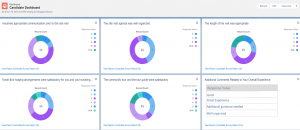
Survey Dashboard feature
In Health Cloud Salesforce survey, when participants complete a survey, you can view the response data on the Analyze tab of the Survey Builder.
![]()
A different type of chart is used for each question type. For easy viewing, survey page distributes the response charts.
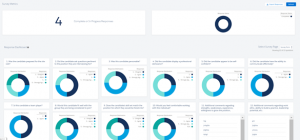
Custom Dashboard to view the survey Response
To customize the dashboard and report with some filter criteria, we must create custom report type with Survey Invitation as a parent object.
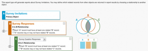
Create Report to show the data in chart format in dashboard:
Create a report for each question in the survey to get the consolidated response of each question from different user. Creating a report and chart for displaying the response will differ based on the question type chosen in the survey form.
Example: create a survey dashboard as like the standard one with filter on survey response completed after November 30th 12:00 AM
While creating the report, choose the custom report type that was created above.
For example, if the question type is a picklist, Multi select picklist or Radio button, then we must create a report with the following steps:
In Outline section:
- Add the Response Name field from Survey Response object in columns section
- Add the Response value and Question Name fields from the Survey Question Response Object in Group rows selection
In Filter section:
- Choose the Question Name field in filter à choose Operator equals / Contains à full or partially copy and paste the Question from the survey form.
- Choose Response completed date and time field à Pick the date from / after we want to show the response in visual chart.
To Add a chart, Click the Add chart button, and choose the format you want to display the response. Here, I have selected Donut as display type, Value as Record count and Sliced by Response Value.
Click Save and the Run button to see the Donut chart format response for an individual question.
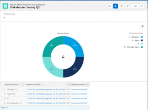
if the question type is Text, then we must create a report with following steps:
In Outline section:
- Add the Response Value field from Survey Question Response object in columns section.
In Filter section:
- Choose the Question Name field in filter à choose Operator equals / Contains à full or partially copy and paste the Question from the survey form.
- Choose Response completed date and time field à Pick the date from / after we want to show the response in visual chart.
Click Save and the Run button to get the response in tabular format for an individual question.
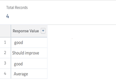 Create a custom Dashboard:
In dashboard, add the components (Reports created for each individual question).
Click the edit icon on the report and check the ‘Use chart setting from report option’ checkbox to get the view of the response as you built in report chart.
 Reference Link:

