Introduction to Salesforce Wave Analytics:
Performing calculations in Wave analytics are made easy with the help of Compare Table. You can define custom formulas with columns of data and view measures side by side. The Compare Table is a column-based visualization and each column has its own filters and measures. The Use Wave Analytics permission is needed to view the visualizations. You can create new columns and navigate from one column to another column either by clicking on the arrow buttons or by using the left and right arrow keys.
Steps to create a Compare Table:
Step 1: Open the dataset that contains the data needed to perform calculations for your business needs.
Step 2: Choose Compare Table from the lists of available chart types.
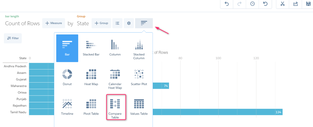
Step 3: Based on your requirement, you can change the measures & filters and group the data.
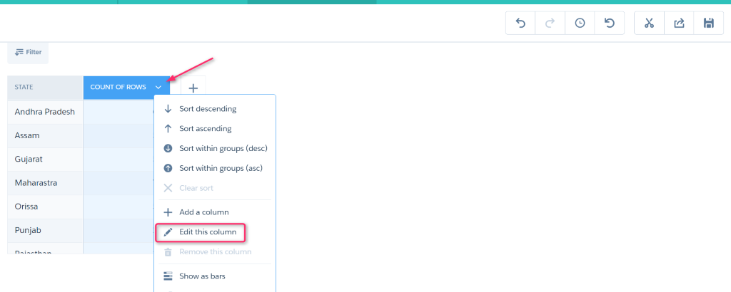
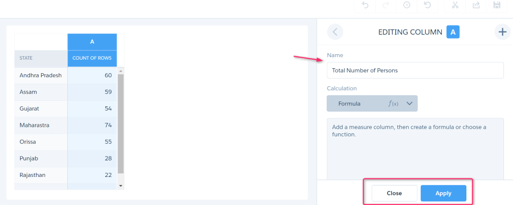
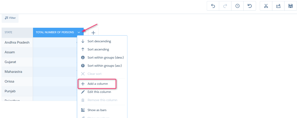
Step 4: To rename the column, click the down arrow at the top right of the column and choose Edit this column option.
Provide a name and choose the Apply option and then choose the Close option to close the edit panel.
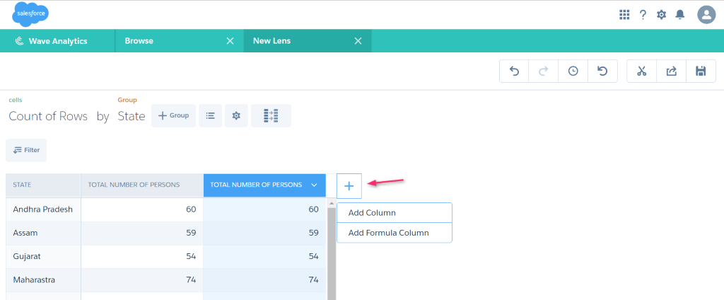
Step 5: To add a new column, click the down arrow at the top right of the existing column and choose Add a column option. A new column is created and the filters and measures are copied from the column that it is created from.
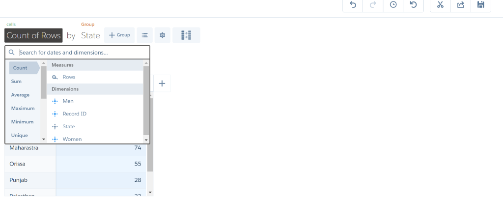
You can also create a new column using the + symbol available next to the right-most column. Here, you can add either a simple column or a formula column by clicking the plus symbol or by pressing the enter key on the keyboard. The available 2 options are
- Add Column – On clicking this option, a column will be created. You should choose Edit this column option to open the edit panel. You can also apply some formulas to it.
- Add Formula Column – On clicking this option, a column will be created and the edit panel will be opened simultaneously, so you can apply some formulas to it easily.
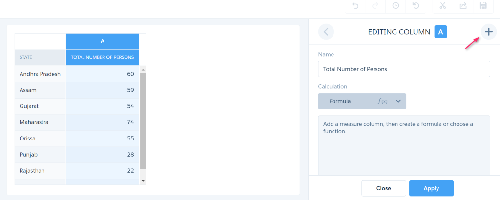
There is another way available in edit panel to create a new column. Click on the plus symbol to create a column. The columns are identified by letters starting from A and increasing in alphabetical order.
You can display the results as bars by using the Show as bars option (1) and delete any column by using the Remove this column option (2). You can also sort the data in ascending or descending order.
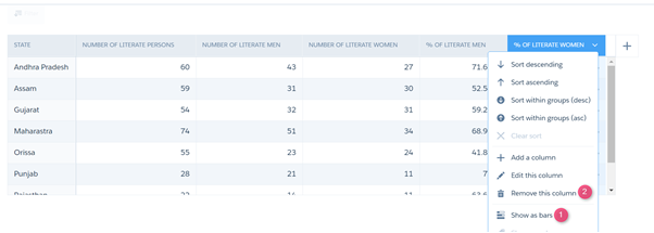
The result is displayed in bar format as shown below.
Step 6: Click on save icon to save the changes you have made.
Window functions:
A list of window functions is available in edit panel to perform useful calculations for some of your business requirements. You can choose any of the window functions under the f(x) option. The compare table will automatically generate the SAQL for these window functions which save your time in writing SAQL. It is also possible to edit the auto generated SAQL in the formula editor. You can see the SAQL under the Formula tab.
The list of window function is shown in the below screenshot.
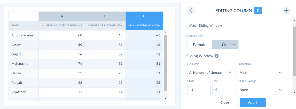
Sliding Window – Used to display the aggregate values such as Sum, Max, Min, Average for the specified column. The value is displayed in the column by comparing the value with the previous value of that column. For Ex. If a column has value as 33,12,56,86 consecutively, and Max is selected as value for aggregate function means, then the result would be 33,33,56,86.
The auto generated SAQL is max(A) over ([-1..0] partition by all order by (‘State__c’)).
Then the SAQL is edited as max(B) over ([-1..0] partition by all order by (‘State__c’)) to obtain the below result.
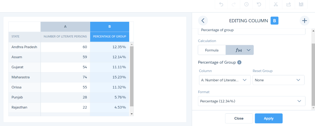
Percentage of Group – Using this window function, you can calculate the percentage of each row either by the group total or by the grand total. The auto generated SAQL is A/sum(A) over ([..] partition by all).
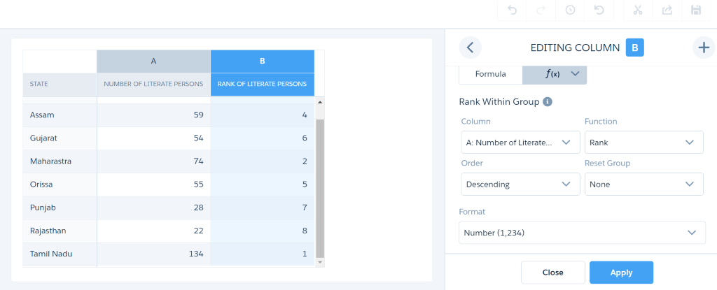
Rank Within Group – Using this window function, you can calculate rank, dense rank, cumulative distribution and row-number functions in a column and display the result either in ascending or descending order. The generated SAQL is rank() over([..] partition by all order by A desc).
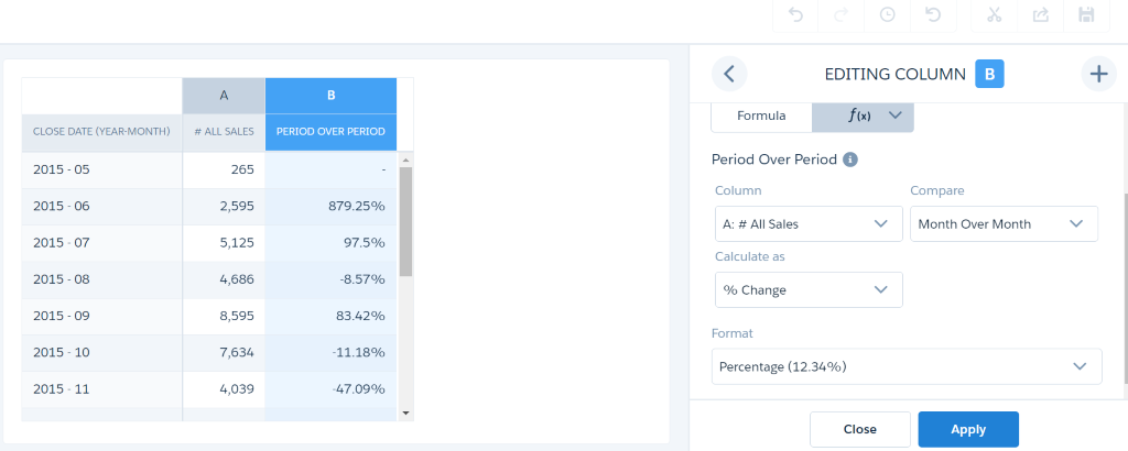
Period Over Period – Using this function, you can calculate the changes in values during some periods of time and display values by comparing over periods of time like a month over month sales. The comparisons can be measured either as a percentage or in units.
The generated SAQL is (A – sum(A) over ([-1..-1] partition by all order by (‘Close_Date_Year ~~~Close_Date_Month’)))/ sum(A) over ([-1..-1] partition by all order by (‘Close_Date_Year ~~~Close_Date_Month’))).
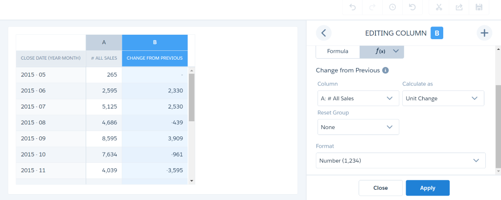
Change from Previous – Using this function, you can calculate the difference between the current and the previous row value. Ex. It is helpful to find the growth of a product in some specified duration. The generated SAQL is
A – sum(A) over ([-1..-1] partition by all order by (‘Close_Date_Year~~~Close_Date_Month’)).
Running Total – Using this function, you can calculate the total value of a current row by summing up all the values of previous row. It is like calculating cumulative frequency. The generated SAQL is sum(A) over ([..0] partition by all order by (‘State__c’)).
Pros:
The following are some of the advantages of using the compare table.
- Compare table allow you to specify separate filters and measures for each column.
- It will automatically disable the options to add measures and filters in the column that has formulas.
- If you want to use SAQL, you can directly enter in the formula editor.
- In window functions, there is an option available called Reset Group which will reset the window function.
Cons:
The following are some of the features which are not possible in the compare table.
- You cannot use the percentile_desc and percentile_cont functions in windowing functions.
- Each column can only have a maximum of 4 groupings.
Summary:
Thus, the compare table reduces your work by creating formulas through its quick and easy features. It reduces your work of writing SAQL for the formulas by automatically creating SAQL in window functions and made them editable to suite your business needs.
References:
Web Links: