Do you need to analyze and refine your business strategy for your business? Are you thinking of completely changing your way of business analysis to something much better than now? If your answer is ‘Yes’, then you can do it with Salesforce Analytics Cloud. You can understand and analyze more about your business with the Analytics Cloud. You can connect any data with everyone in your company from any data source.
By using Analytics Cloud, we can explore more on Business Strategies by asking questions across CRM, ERP, and etc… And we can collaboratively have discussions, ask questions and get answers from one central place. Access the Analytics Cloud on mobile devices on the go, in the palm of your hand.
The data can be explored with Lenses and Dashboards in Analytics Cloud. Here, we can use Salesforce and External data to integrate your business data with Salesforce Analytics Cloud. The data can be updated based on schedules.
Components
Three components are available in Analytics Cloud.
- Datasets
- Lenses
- Dashboards
Those are all the assets of Analytics Cloud. In addition, the App is also available to keep the components together.
Dataset:
The Dataset contains data from Salesforce or External system, or excel data to provide a specific view into data based on how we have customize it. It could be even based on a data pipeline.
Lens:
It’s a particular view into a Dataset’s data using which you do visualization and exploratory analysis.
Dashboard:
The Dashboard Designer allows to create dashboards from multiple lenses with different components to create interactive dashboards and provide meaningful insights from the raw data. It contains widgets like chart, compare table, raw data table, number, range, list, toggle, text, and date for effective design to show insights into different types of data.
App:
The Apps in the Salesforce Analytics Cloud are like folders that holds the Datasets, Lenses and the Dashboards which can be private or shared.
The description below shows how to use interactive Apps, datasets, lenses and dashboards to get the insights for the business.
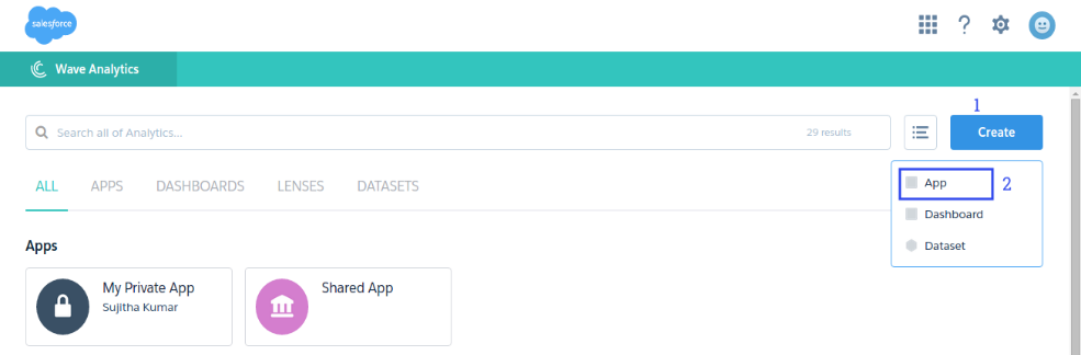
Create Apps
Select Wave Analytics from App picker.
1. Click [Create] button.
2. Select App
Create a Dataset
1. Click the [Create] button.
2. Select Dataset
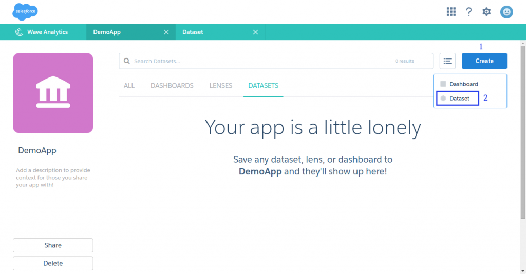
3. Select an Excel file (CSV)
4. Enter name for the Dataset
5. Click the [Create] button.
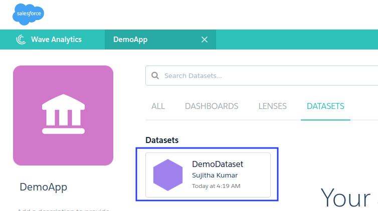
Now, the Dataset is successfully created as below:
Create A Lens
1. Click the Dataset.
2. Click the Save icon to save the Lense. Lense.3. Enter Name and Description for Lens as below:
4. Click the [Save] button.
Now the Lens is successfully saved. Here, we can do the following actions according to our data as well as our business analysis.
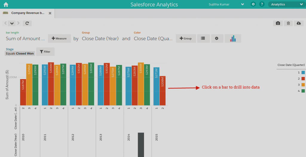
Company Revenue by Year by Quarter
The picture below shows the company revenue by year by quarter. The lenses gives insights into the data by measures, groups and filter and also drilling down is possible by clicking on a particular bar on the chart.
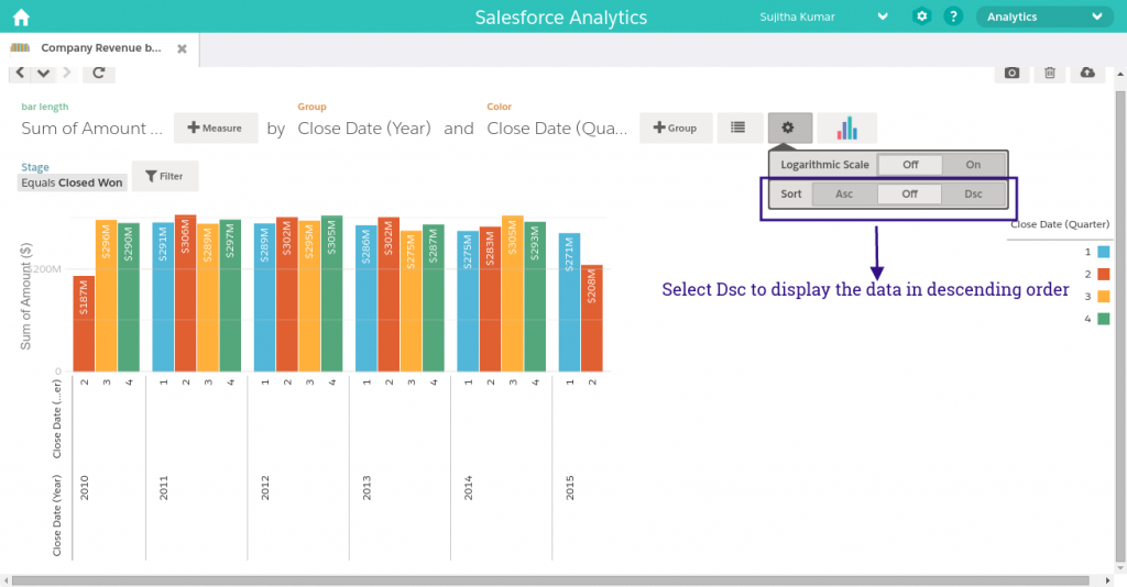
Sorting the Data
Here, we can sort the Sum of Amount, by using the gear icon. Now, the Sum of Amount is sorted as Descending. So, the Sales Manager can view the ordered data.
We can sort the data in either Ascending or Descending order by using the sorting options. Now, the data is aligned based on the Year once the data sorting is completed.
Chart Type
By changing the chart type, we can get the different visualization based on the filter criteria.
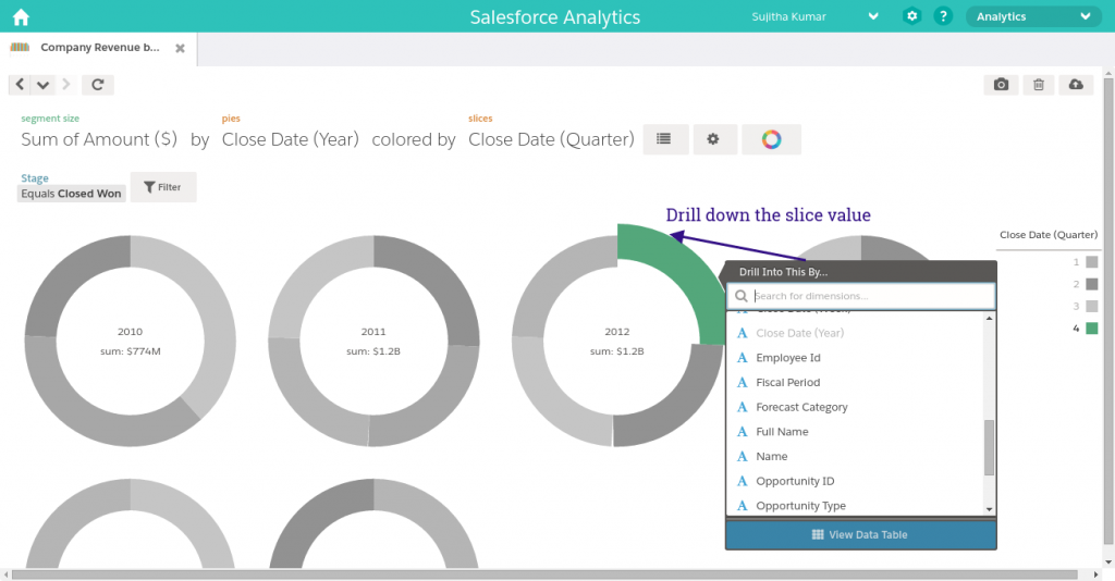
For the same filter criteria, we can get the different type of view by using the Donut chart. It displays the data by quarterly.
Slice down from the Chart
By slicing down a particular slice form the chart, we can get insights of the data.
Drill down the Slice Data
Drill down the data based on OwnerID – Year: 2012, Quarters: 4
Create A Dashboard
We can create dashboards by combining one or more lens using Clip to Designer icon.
1. Click the Clip to Designer icon.
2. By using the tools, we can design and save the Dashboard as below:

Summary
Wave Analytics Cloud is mainly focused on Business Analysis to improve the business strategies of organizations. The data can be accessed from any source and the users can use it from anywhere using any device. Refer this link to learn more about Salesforce Wave Analytics Cloud Overview of Salesforce Analytics Cloud.